al

Reconstructing Pasito's website
Date
July 2021
UX/UI, Graphic Design
What I Did
Team
Angela Lin
Pauline Roteta
Julie Scotland
With a bare minimum website with old branding, Pasito needed a new look to reflect the new messaging and product offering.
Tools
Figma, Jira

THE PROBLEM
How do we give the website a new and modern design that draws in clients while delivering all the necessary information about Pasito and its mission?
RESEARCH
Scoping out the competition and their messaging
Original Website
When the co-founders and I examined the original website, we knew that it lacked the proper information and design to attract clients.
I first looked at Pasito's competitors and how they displayed their product and mission. With a list of competitors and ideas, I reported back to Pauline and Julie, the co-founders. I made design decisions for the new website with the competitors in mind.
After deciding on our basic layout and list of information needed, Pauline and Julie wrote the content for the website with new messaging and an updated product offering while I drafted the new design for the website.

Sorting the Important Information
With all the content written, I worked with Pauline and Julie to sort the information into four pages.
-
a home page with important background information and differentiation from competitors
-
a "for employers" page to show how Pasito can benefit their clients
-
an "about us" page with Pauline and Julie's story and leadership details
-
a call-to-action page with a form for potential clients to fill out.
DESIGN
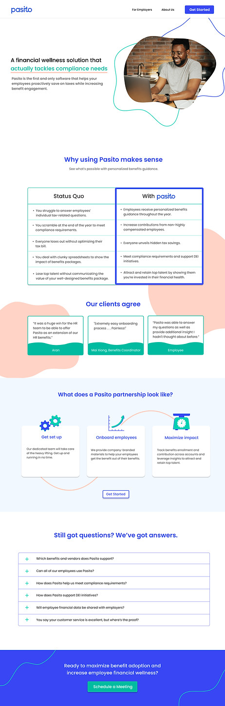
Creating a website that tells the story of financial health among employees.
Deliverables
After multiple iterations, I developed the final design for the website in Figma. Buttons were carefully placed to lead users around the website. The motifs for the website are curvy shapes and lines that intertwine, which align with our message of inclusivity and support for employees and employers.